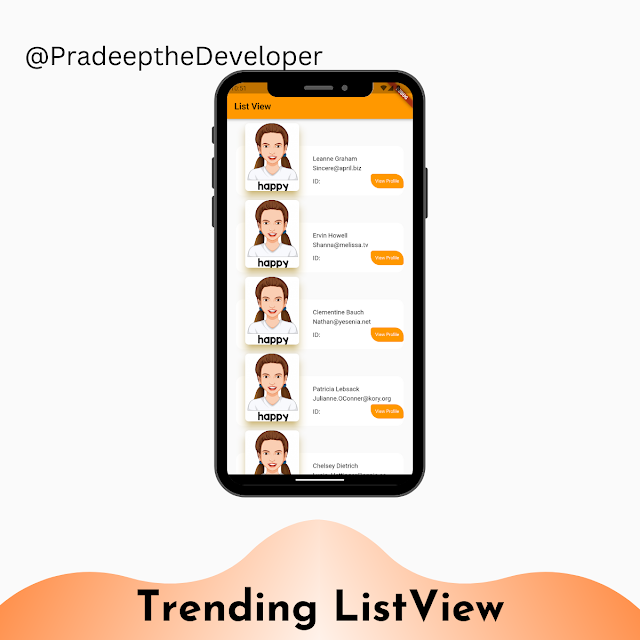
In this Blog, we'll explore how to create a dynamic and trending ListView using Flutter. ListView is a commonly used widget in Flutter for displaying lists of items in a scrollable manner, and there are many ways to make a ListView stand out and attract users' attention. In this post, we'll show you how to create a custom ListView that displays a trending list of items that updates automatically as the data changes. We'll cover techniques for building a scrolling list with custom animations, infinite scrolling, and dynamic sorting. You'll learn how to create your own custom widgets, animations, and gestures to make a ListView that looks and feels unique and engaging. By the end of this tutorial, you'll have all the tools you need to create a trending ListView that keeps your users coming back for more.
In Flutter, a list view is a widget that allows you to display a list of items that can be scrolled vertically. It is commonly used to display large sets of data, such as lists of contacts, messages, or products in an e-commerce app.
Flutter provides several different types of list view widgets, including:
- ListView: This is a basic list view widget that displays a scrolling list of items.
- GridView: This widget allows you to display a grid of items, where each item can be tapped to navigate to a detailed screen.
- ListView.builder: This widget is used to build a list view with a large number of items. It creates the list of items dynamically as they are needed, rather than creating all of them at once.
- ListView.separated: This widget is similar to ListView.builder, but it allows you to add separators between the items in the list.
- ListView.custom: This widget is similar to ListView.builder, but it provides more control over the layout of the list items.
import 'package:flutter/material.dart';

class CardView extends StatelessWidget {
  final int? id;
  final String? imageUrl;
  final String? title;
  final String? desc;

  const CardView({super.key, this.id, this.imageUrl, this.title, this.desc});

  @override
  Widget build(BuildContext context) {
    return Container(
      margin: const EdgeInsets.symmetric(vertical: 10, horizontal: 20),
      child: Column(
        crossAxisAlignment: CrossAxisAlignment.stretch,
        children: [
          Stack(
            clipBehavior: Clip.none,
            children: [
              Positioned(
                top: 50,
                // bottom: -50.w,
                left: 0,
                right: 0,
                child: Container(
                  constraints: const BoxConstraints(maxHeight: 110),
                  padding:
                      const EdgeInsets.only(top: 20, bottom: 10, left: 170),
                  decoration: BoxDecoration(
                      color: Colors.white,
                      borderRadius: BorderRadius.circular(15)),
                  child: Column(
                    crossAxisAlignment: CrossAxisAlignment.start,
                    children: [
                      Text(title!),
                      // ignore: prefer_const_constructors
                      SizedBox(
                        height: 5,
                      ),
                      Text(desc!),
                      const SizedBox(
                        height: 5,
                      ),
                      Row(
                        mainAxisAlignment: MainAxisAlignment.spaceBetween,
                        crossAxisAlignment: CrossAxisAlignment.center,
                        children: [
                          Text('ID:'),
                          CustomButton(label: 'View Profile', onPressed: () {}),
                        ],
                      )
                    ],
                  ),
                ),
              ),
              Card(
                  elevation: 15,
                  margin: const EdgeInsets.only(left: 20),
                  shape: RoundedRectangleBorder(
                      borderRadius: BorderRadius.circular(10)),
                  shadowColor: Colors.amber,
                  child: Container(
                    height: 150,
                    width: 120,
                    child: ClipRRect(
                      borderRadius: BorderRadius.circular(8.0),
                      child: Image.network(
                        'https://img.freepik.com/free-vector/girl-with-happy-facial-expression_1308-24889.jpg?w=900&t=st=1676956300~exp=1676956900~hmac=322c18312d0c8dbbcc20efe019ecdb1d4b2c3706da00bd7384fe1dbb05d69af7',
                        fit: BoxFit.cover,
                      ),
                    ),
                  )),
            ],
          )
        ],
      ),
    );
  }
}

class CustomButton extends StatelessWidget {
  final String label;
  final Function onPressed;

  CustomButton({super.key, required this.label, required this.onPressed});

  @override
  Widget build(BuildContext context) {
    return GestureDetector(
      onTap: () {},
      child: ClipRRect(
        borderRadius: const BorderRadius.only(
            bottomLeft: Radius.circular(20), topRight: Radius.circular(20)),
        child: Container(
          padding: const EdgeInsets.symmetric(horizontal: 10, vertical: 10),
          decoration: BoxDecoration(
            color: Theme.of(context).colorScheme.primary,
            borderRadius: BorderRadius.circular(5),
          ),
          child: Text(
            label,
            style: const TextStyle(
              color: Colors.white,
              fontSize: 10,
            ),
          ),
        ),
      ),
    );
  }
}


