Building a Custom AppTabBar with Login and Sign Up Pages in Flutter
In this blog post, we will explore how to create a custom AppTabBar in Flutter that allows users to switch between a login page and a sign-up page. We'll provide a step-by-step explanation of the code and discuss the different components involved.
Introduction
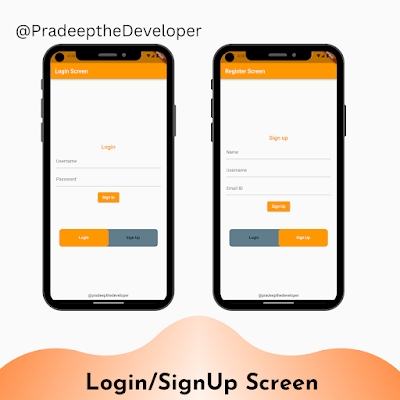
The code provided demonstrates the implementation of a custom AppTabBar widget that consists of two tabs: "Login" and "Sign Up." Tapping on a tab switches the content displayed on the screen. The login page contains text fields for entering a username and password, along with a sign-in button. The sign-up page includes text fields for name, username, email ID, and a sign-up button.
MyApp Widget
The MyApp widget is the root widget of the application. It is a stateful widget that extends StatefulWidget. Inside the build method of MyApp, we define the MaterialApp and Scaffold widgets to provide the overall structure of the app. The Scaffold widget defines the app bar and body content.
AppTabBar Widget
The AppTabBar widget is a custom widget that represents the tab bar displayed above the login and sign-up pages. It extends StatefulWidget to handle state changes. The widget takes several properties: tab1 (representing the label for the first tab), tab2 (representing the label for the second tab), tab3 (an optional label for a third tab), and controller (a TabController instance).
Inside the build method of AppTabBar, we calculate the height and width of the screen using MediaQuery. Then, we return a Flexible widget with a Padding and SizedBox as its child. The Padding widget adds some spacing around the tab bar, and the SizedBox sets its height and width.
Within the SizedBox, we define a DecoratedBox widget, which allows us to customize the background and border of the tab bar. We set the color to Colors.blueGrey and apply a circular border radius. Inside the DecoratedBox, we place a TabBar widget.
The TabBar widget defines the appearance and behavior of the tabs. We set the unselectedLabelColor to Colors.black and labelColor to Colors.white. The indicator property is used to specify the appearance of the selected tab indicator. In this case, we set the color to Colors.orange and apply a circular border radius.
The TabBar widget takes a TabController instance to manage the state of the tabs. The controller property is set to the widget.controller passed as a parameter to AppTabBar. Finally, we define the tabs using the tabs property. In this example, we have two tabs: one for login and one for sign-up. If a third tab is specified (tab3), it is added using a conditional statement.
LoginPage and SignUpPage Widgets
The LoginPage and SignUpPage widgets represent the content displayed when the corresponding tab is selected. These widgets are stateless and extend StatelessWidget.
Inside the build method of LoginPage, we return a Padding widget with a Container as its child. The Container is centered using the Center widget, and it contains a Column widget to organize the child widgets vertically. The Column contains a TextField widget for the username, another TextField widget for the password (with obscureText set to true for password masking), and an ElevatedButton widget for the sign-in functionality.
The build method of SignUpPage is similar to LoginPage, except it includes additional TextField widgets for the name and email ID fields.
Full Source Code
class MyApp extends StatefulWidget {
  const MyApp({super.key});

  @override
  // ignore: library_private_types_in_public_api
  _MyAppState createState() => _MyAppState();
}

class _MyAppState extends State<MyApp> with SingleTickerProviderStateMixin {
  late TabController _tabController;

  @override
  void initState() {
    super.initState();
    _tabController = TabController(length: 2, vsync: this);
  }

  @override
  void dispose() {
    _tabController.dispose(); // Dispose of the TabController
    super.dispose();
  }

  @override
  Widget build(BuildContext context) {
    return MaterialApp(
      home: Scaffold(
        appBar: AppBar(
          title: const Text('Register Screen'),
          backgroundColor: Colors.orange,
        ),
        body: Column(
          children: [
            Expanded(
              child: Column(
                mainAxisAlignment: MainAxisAlignment.center,
                children: [
                  Expanded(
                    child: Padding(
                      padding: const EdgeInsets.all(12.0),
                      child: TabBarView(
                        controller: _tabController,
                        children: const [
                          LoginPage(), // Replaced the first Tab content with LoginPage
                          SignUpPage(), // Replaced the second Tab content with SignUpPage
                        ],
                      ),
                    ),
                  ),
                  AppTabBar(
                    tab1: 'Login',
                    tab2: 'Sign Up',
                    controller: _tabController,
                  ),
                ],
              ),
            ),
            Padding(
              padding: const EdgeInsets.all(8.0),
              child: Text('@pradeepthedeveloper'),
            ),
          ],
        ),
      ),
    );
  }
}

class AppTabBar extends StatefulWidget {
  final String tab1;
  final String tab2;
  final String? tab3;
  final TabController controller;

  const AppTabBar({
    Key? key,
    required this.tab1,
    required this.tab2,
    this.tab3,
    required this.controller,
  }) : super(key: key);

  @override
  // ignore: library_private_types_in_public_api
  _AppTabBarState createState() => _AppTabBarState();
}

class _AppTabBarState extends State<AppTabBar> {
  @override
  void dispose() {
    widget.controller.dispose(); // Dispose of the TabController
    super.dispose();
  }

  @override
  Widget build(BuildContext context) {
    var height = MediaQuery.of(context).size.height;
    var width = MediaQuery.of(context).size.width;
    return Flexible(
      child: Padding(
        padding: const EdgeInsets.all(8.0),
        child: SizedBox(
          height: height * 0.07,
          width: width * 0.85,
          child: DecoratedBox(
            decoration: BoxDecoration(
              color: Colors.blueGrey,
              borderRadius: BorderRadius.circular(10),
            ),
            child: TabBar(
              unselectedLabelColor: Colors.black,
              labelColor: Colors.white,
              //labelStyle: AppStyles.tabTextStyle,
              indicator: BoxDecoration(
                borderRadius: BorderRadius.circular(10),
                color: Colors.orange,
              ),
              controller: widget.controller,
              tabs: [
                Tab(
                  text: widget.tab1,
                ),
                Tab(
                  text: widget.tab2,
                ),
                if (widget.tab3 != null)
                  Tab(
                    text: widget.tab3!,
                  ),
              ],
            ),
          ),
        ),
      ),
    );
  }
}

class LoginPage extends StatelessWidget {
  const LoginPage({super.key});

  @override
  Widget build(BuildContext context) {
    return Padding(
      padding: const EdgeInsets.all(8.0),
      child: Container(
        child: Center(
          child: Column(
            mainAxisAlignment: MainAxisAlignment.center,
            children: [
              const Text(
                'Login',
                style: TextStyle(
                    fontWeight: FontWeight.bold,
                    fontSize: 20,
                    color: Colors.orange),
              ),
              const SizedBox(height: 16.0),
              const TextField(
                decoration: InputDecoration(
                  hintText: 'Username',
                ),
              ),
              const SizedBox(height: 16.0),
              const TextField(
                obscureText: true,
                decoration: InputDecoration(
                  hintText: 'Password',
                ),
              ),
              const SizedBox(height: 16.0),
              ElevatedButton(
                style: ElevatedButton.styleFrom(backgroundColor: Colors.orange),
                onPressed: () {
                  // Perform login functionality
                },
                child: const Text('Sign In'),
              ),
            ],
          ),
        ),
      ),
    );
  }
}

class SignUpPage extends StatelessWidget {
  const SignUpPage({super.key});

  @override
  Widget build(BuildContext context) {
    return Padding(
      padding: const EdgeInsets.all(8.0),
      child: Container(
        child: Center(
          child: Column(
            mainAxisAlignment: MainAxisAlignment.center,
            children: [
              const Text(
                'Sign up',
                style: TextStyle(
                    fontWeight: FontWeight.bold,
                    fontSize: 20,
                    color: Colors.orange),
              ),
              const SizedBox(height: 16.0),
              const TextField(
                decoration: InputDecoration(
                  hintText: 'Name',
                ),
              ),
              const SizedBox(height: 16.0),
              const TextField(
                decoration: InputDecoration(
                  hintText: 'Username',
                ),
              ),
              const SizedBox(height: 16.0),
              const TextField(
                decoration: InputDecoration(
                  hintText: 'Email ID',
                ),
              ),
              const SizedBox(height: 16.0),
              ElevatedButton(
                style: ElevatedButton.styleFrom(backgroundColor: Colors.orange),
                onPressed: () {
                  // Perform signup functionality
                },
                child: const Text('Sign Up'),
              ),
            ],
          ),
        ),
      ),
    );
  }
}
Conclusion
In this blog post, we covered the implementation of a custom AppTabBar widget that enables users to switch between a login page and a sign-up page in a Flutter application. We explained the code step by step, discussing the MyApp, AppTabBar, LoginPage, and SignUpPage widgets.
Using this example as a foundation, you can further customize the tab bar and the content of each tab to meet the specific requirements of your application. Flutter's flexible and extensible framework allows for endless possibilities in designing beautiful and functional user interfaces.


Comments
Post a Comment