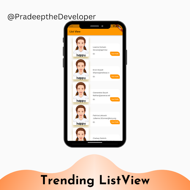
Create a Custom AppBar with Leading and Trailing Widgets in Flutter
The AppBar is a common component in Flutter that provides a consistent user interface element for displaying titles, icons, and actions at the top of the screen. However, sometimes you may need to customize the AppBar by adding your own leading and trailing widgets. In this tutorial, we'll learn how to create a custom AppBar with leading and trailing widgets in Flutter, which can help enhance the user experience and engagement in your app.
Prerequisites:
Before we proceed, make sure you have Flutter installed and set up on your machine.
Step 1: Setting up the Project:
To get started, create a new Flutter project or open an existing one in your preferred IDE. Once your project is set up, open the main.dart file and update it with the following code:
import 'package:flutter/material.dart';

void main() {
  runApp(MyApp());
}

class MyApp extends StatelessWidget {
  @override
  Widget build(BuildContext context) {
    return MaterialApp(
      title: 'Custom AppBar Example',
      theme: ThemeData(
        primarySwatch: Colors.blue,
      ),
      home: MyScreen(),
    );
  }
}
Step 2: Creating the CommonAppBar Widget:
In Flutter, we can create reusable widgets to simplify our code and ensure consistency across screens. To create the custom AppBar with leading and trailing widgets, let's define a `CommonAppBar` widget. Replace the content of main.dart with the following code:
import 'package:flutter/material.dart';

void main() {
  runApp(MyApp());
}

class MyApp extends StatelessWidget {
  @override
  Widget build(BuildContext context) {
    return MaterialApp(
      title: 'Custom AppBar Example',
      theme: ThemeData(
        primarySwatch: Colors.blue,
      ),
      home: MyScreen(),
    );
  }
}

class CommonAppBar extends StatelessWidget implements PreferredSizeWidget {
  final String title;
  final Widget? leading;
  final Widget? trailing;

  CommonAppBar({required this.title, this.leading, this.trailing});

  @override
  Widget build(BuildContext context) {
    return AppBar(
      title: Text(title),
      leading: leading,
      actions: <Widget>[
        if (trailing != null) trailing!,
      ],
    );
  }

  @override
  Size get preferredSize => Size.fromHeight(kToolbarHeight);
}
Step 3: Implementing the Custom AppBar in a Screen:
Now that we have our `CommonAppBar` widget ready, let's implement it in a screen. In this example, we'll create a `MyScreen` widget and use the `CommonAppBar` with a leading and trailing widget. Replace the content of main.dart with the following code:
import 'package:flutter/material.dart';

void main() {
  runApp(MyApp());
}

class MyApp extends StatelessWidget {
  @override
  Widget build(BuildContext context) {
    return MaterialApp(
      title: 'Custom AppBar Example',
      theme: ThemeData(
        primarySwatch: Colors.blue,
      ),
      home: MyScreen(),
    );
  }
}

class MyScreen extends StatelessWidget {
  @override
  Widget build(BuildContext context) {
    return Scaffold(
      appBar: CommonAppBar(
        title: 'My App',
        leading: IconButton(
          icon: Icon(Icons.menu),
          onPressed: () {
            // Handle leading button press
          },
        ),
        trailing: IconButton(
          icon: Icon(Icons.notifications),
          onPressed: () {
            // Handle trailing button press
          },
        ),
      ),
      body: Container(
        // Your screen content here
      ),
    );
  }
}

class CommonAppBar extends StatelessWidget implements PreferredSizeWidget {
  final String title;
  final Widget? leading;
  final Widget? trailing;

  CommonAppBar({required this.title, this.leading, this.trailing});

  @override
  Widget build(BuildContext context) {
    return AppBar(
      title: Text(title),
      leading: leading,
      actions: <Widget>[
        if (trailing != null) trailing!,
      ],
    );
  }

  @override
  Size get preferredSize => Size.fromHeight(kToolbarHeight);
}
Step 4: Running the App:
Save the changes and run the app on a device or emulator. You should now see the custom AppBar at the top of the screen with a leading menu button and a trailing notifications button. You can customize the leading and trailing widgets according to your app's requirements.
Conclusion:
In this tutorial, we learned how to create a custom AppBar with leading and trailing widgets in Flutter. By using the `CommonAppBar` widget, you can easily add additional functionality to your app's AppBar, enhancing the user experience and engagement. Feel free to experiment with different leading and trailing widgets to suit your app's design and functionality.
That's it! You now have the knowledge to create a custom AppBar with leading and trailing widgets in Flutter.
Happy coding!


Comments
Post a Comment